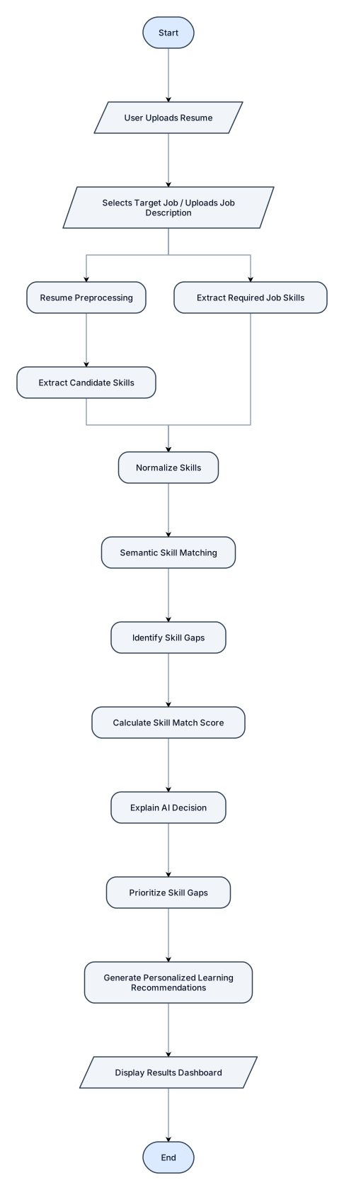
Create a professional academic flowchart for “An Explainable AI-Based System for Skill Gap Analysis.” Follow this exact workflow: Start ↓ User Uploads Resume ↓ Selects Target Job / Uploads Job Description ↓ Resume Preprocessing ↓ Extract Candidate Skills ↓ Extract Required Job Skills ↓ Normalize Skills ↓ Semantic Skill Matching ↓ Identify Skill Gaps ↓ Calculate Skill Match Score ↓ Explain AI Decision ↓ Prioritize Skill Gaps ↓ Generate Personalized Learning Recommendations ↓ Display Results Dashboard ↓ End Use standard flowchart symbols, clean arrows, white background, professional academic design, blue and gray palette, high readability, no decorative graphics. Title: “Workflow of the Proposed Skill Gap Analysis System”. 16:9 landscape, suitable for B.Tech research report.
Diagram Examples from Real Visitor Prompts
Browse eligible diagrams shared by FreeDiagram visitors, inspect the exact prompts, and build your own version.
Browse 1021 real creationsMain diagram studio
Showing 433–456 of 608. No stock examples or system defaults. Choose a tool, study a real result, then reopen its prompt as your starting point.
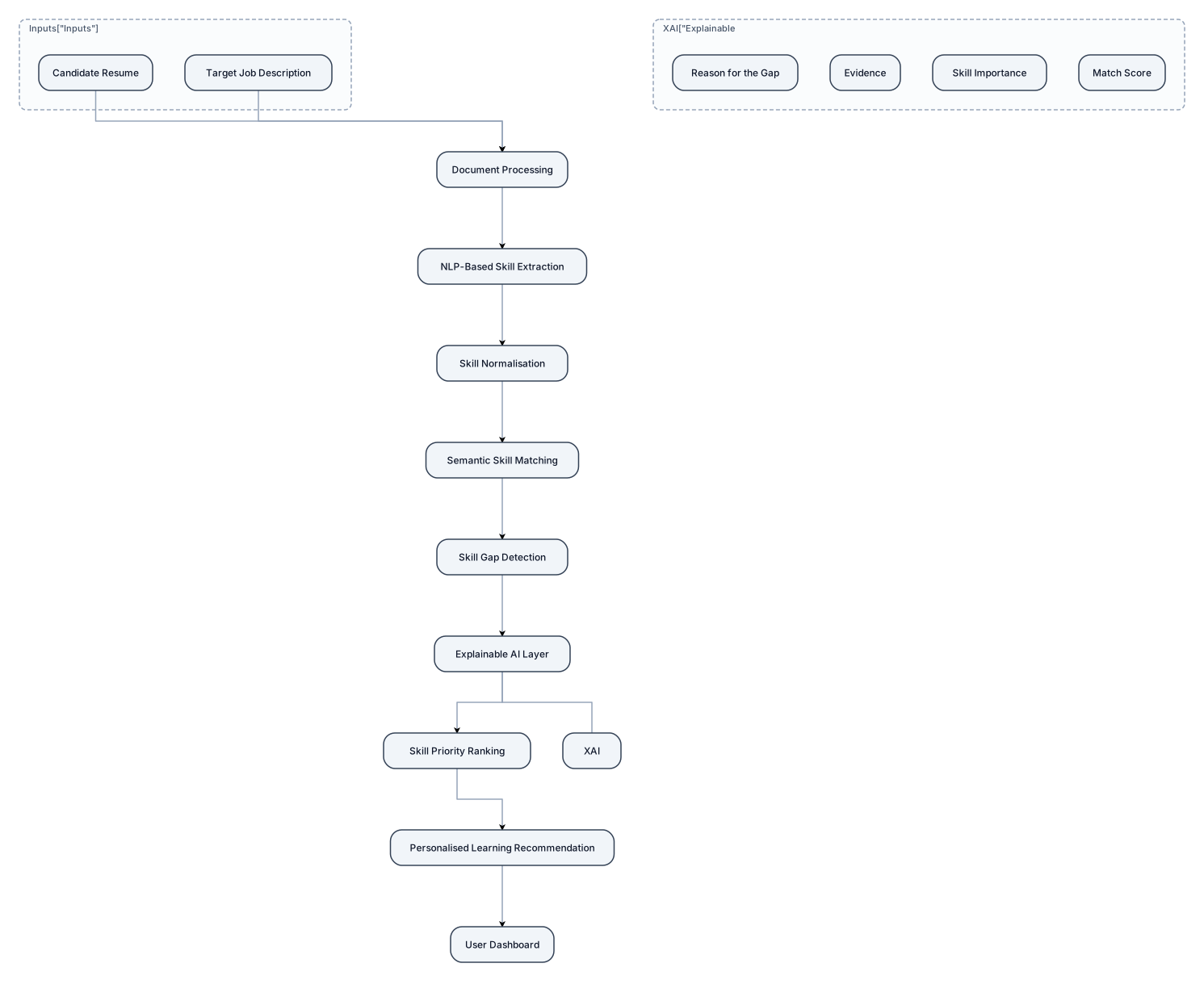
Create a clean, professional system architecture diagram for a final-year AI research project titled “An Explainable AI-Based System for Skill Gap Analysis". The architecture must follow this exact flow from top to bottom: Candidate Resume + Target Job Description ↓ Document Processing ↓ NLP-Based Skill Extraction ↓ Skill Normalisation ↓ Semantic Skill Matching ↓ Skill Gap Detection ↓ Explainable AI Layer ↓ Skill Priority Ranking ↓ Personalised Learning Recommendation ↓ User Dashboard Show the candidate's resume and job description as two separate inputs entering the system. Use arrows to clearly represent data flow. The Explainable AI layer should show the reason for the gap, evidence, skill importance, and match score. Use professional academic architecture-diagram style, white background, rectangular rounded boxes, clean arrows, consistent typography, minimal icons, blue/grey technology theme, no 3D effects, and no unnecessary decoration. Title at top: “Architecture of the Proposed Explainable AI-Based Skill Gap Analysis System”. Make all labels large, readable and spelt exactly as provided. 16:9 landscape, high resolution.
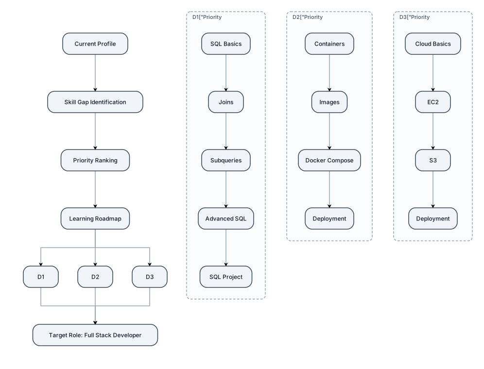
Personalised Learning Recommendation Roadmap ⭐ Prompt Create a professional academic infographic titled "Personalised Skill Development Roadmap". Based on a candidate's identified skill gaps, show: Current Profile ↓ Skill Gap Identification ↓ Priority Ranking ↓ Learning Roadmap Example: Priority 1: SQL SQL Basics → Joins → Subqueries → Advanced SQL → SQL Project Priority 2: Docker Containers → Images → Docker Compose → Deployment Priority 3: AWS Cloud Basics → EC2 → S3 → Deployment At the end: Target Role: Full Stack Developer Use a clean roadmap design, a professional academic style, a white background, a blue/grey palette, clear arrows and readable text, and no unnecessary decoration.
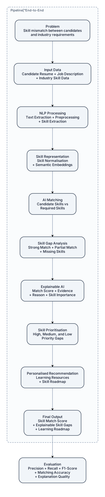
Create a high-quality professional academic research framework diagram for the project “An Explainable AI-Based System for Skill Gap Analysis". Show the complete end-to-end pipeline: Problem Skill mismatch between candidates and industry requirements ↓ Input Data Candidate Resume + Job Description + Industry Skill Data ↓ NLP Processing Text Extraction + Preprocessing + Skill Extraction ↓ Skill Representation Skill Normalisation + Semantic Embeddings ↓ AI Matching Candidate Skills vs Required Skills ↓ Skill Gap Analysis Strong Match + Partial Match + Missing Skills ↓ Explainable AI Match Score + Evidence + Reason + Skill Importance ↓ Skill Prioritisation High, Medium, and Low Priority Gaps ↓ Personalised Recommendation Learning Resources + Skill Roadmap ↓ Final Output Skill Match Score + Explainable Skill Gaps + Learning Roadmap At the bottom show: Evaluation Precision + Recall + F1-Score + Matching Accuracy + Explanation Quality
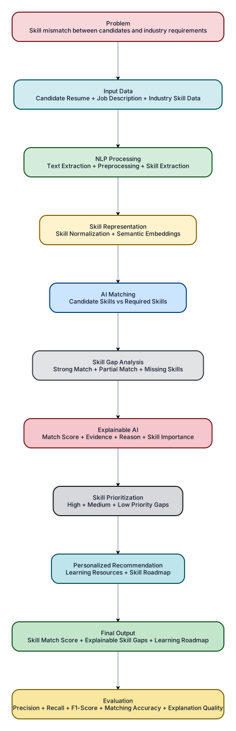
Create a high-quality professional academic research framework diagram for the project “An Explainable AI-Based System for Skill Gap Analysis.” Show the complete end-to-end pipeline: Problem Skill mismatch between candidates and industry requirements ↓ Input Data Candidate Resume + Job Description + Industry Skill Data ↓ NLP Processing Text Extraction + Preprocessing + Skill Extraction ↓ Skill Representation Skill Normalization + Semantic Embeddings ↓ AI Matching Candidate Skills vs Required Skills ↓ Skill Gap Analysis Strong Match + Partial Match + Missing Skills ↓ Explainable AI Match Score + Evidence + Reason + Skill Importance ↓ Skill Prioritization High + Medium + Low Priority Gaps ↓ Personalized Recommendation Learning Resources + Skill Roadmap ↓ Final Output Skill Match Score + Explainable Skill Gaps + Learning Roadmap At the bottom show: Evaluation Precision + Recall + F1-Score + Matching Accuracy + Explanation Quality
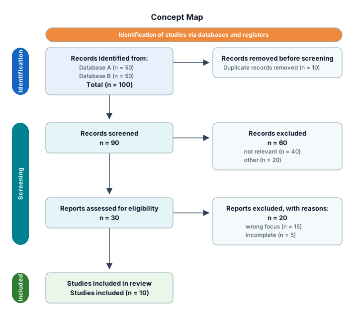
just mak a concept map that I can modify
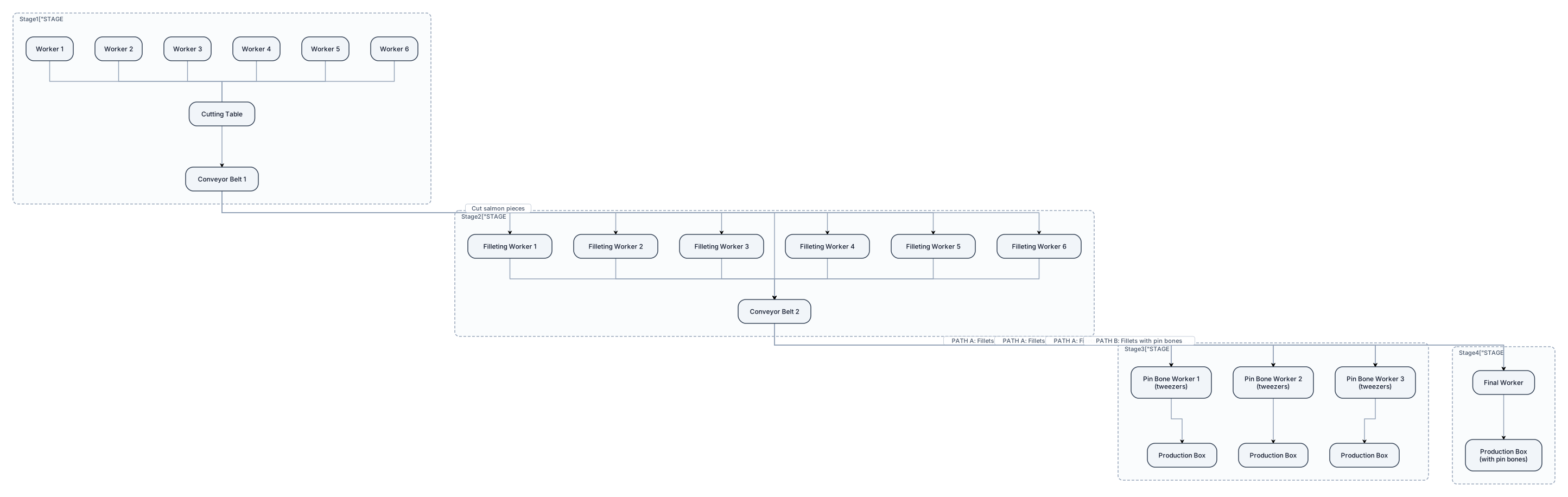
Create a detailed top-view flowchart of a salmon processing production line in a fish factory. The production line has FOUR main stages: 1. KLYVA / CUTTING: Six workers cut the salmon at a long cutting table. The six workers are positioned on both sides of the cutting table, facing each other. A conveyor belt runs along the production line. After cutting, each worker places the salmon pieces directly onto the conveyor belt. 2. FILLETING: The conveyor transports the cut salmon to the next station. Six or more workers perform the filleting process. After filleting, the workers place the salmon fillets directly onto a second conveyor belt. 3. PIN BONE REMOVAL: The second conveyor transports the fillets to workers who inspect the fillets and remove remaining pin bones using tweezers. After removing the pin bones, they place the finished fillets directly into production boxes. 4. FINAL BOXING: Fillets that still contain pin bones continue on the conveyor without going through the pin-bone removal workers. The conveyor carries them to the end of the line, where one worker collects them and places them into separate production boxes. Show the complete production line from above. Clearly show: * 6 cutting workers * Cutting table * Conveyor belts * 6 or more filleting workers * Pin-bone removal workers using tweezers * Production boxes * One final worker at the end of the conveyor * Salmon moving in the correct direction * Arrows showing the direction of movement The layout must clearly show that after filleting there are TWO possible paths: PATH A: Fillets → Pin Bone Removal → Boxes PATH B: Fillets with remaining pin bones → Conveyor → Final Worker → Boxes Use a clean professional industrial diagram style. Make the layout realistic and easy for factory management to understand. Do not add any other production stages. Do not change the order of the four stages.
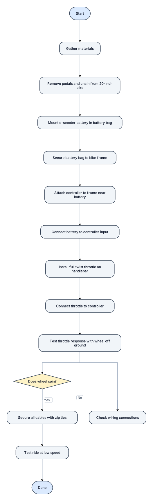
Make me a step by step diagram of how to make a mini e bike, the items are, a 20 inch bike, e scooter battery, battery bag, controller for a full twist throttle.
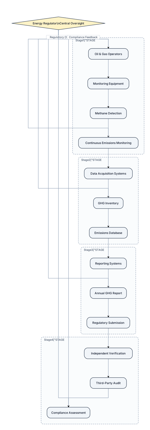
Create a professional regulatory MRV framework for the oil and gas sector. Show four stages: Measurement → Data Collection → Reporting → Verification. Place the Energy Regulator at the center overseeing the entire process. Include operators, monitoring equipment, methane detection, GHG inventory, reporting systems, independent verification, compliance and regulatory oversight. Use a clean professional layout suitable for an international energy conference PowerPoint presentation
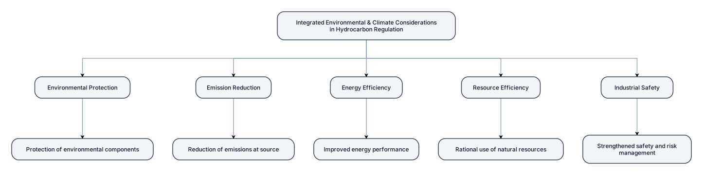
Create a professional Integrated Environmental and Climate Considerations into Hydrocarbon Regulation for the oil and gas sector. Show five stages:Environmental Protection Protection of environmental components Emission Reduction Reduction of emissions at source Energy Efficiency Improved energy performance Resource Efficiency Rational use of natural resources Industrial Safety Strengthened safety and risk management. Use a clean professional layout suitable for an international energy conference PowerPoint presentation.

# ARGO AI Ocean Data Assistant Flowchart Create a clean, modern horizontal flowchart for a college project presentation. The system should show this complete process: User asks a question in natural language → AI understands the question using NLP → Extracts required information such as temperature, salinity, pressure/depth, location and time → Validates the extracted parameters → Retrieves relevant observations from ARGO ocean databases → Processes and analyzes the retrieved data → Generates a relevant response → Automatically creates suitable visualizations such as maps, charts and ocean profiles → AI generates simple and explainable insights → Delivers the final answer to the user in plain language Use these 10 stages as the main boxes: 1. Query Input 2. NLP Processing 3. Information Extraction 4. Validation 5. ARGO Data Query 6. Data Processing 7. Response Generation 8. Visualization 9. AI Insight 10. Delivery Use a left-to-right layout with clear arrows connecting every stage. Keep the design professional, minimal and suitable for a PowerPoint presentation. Use rounded rectangular boxes, simple AI/ocean/data icons, consistent spacing and short labels. Do not add unnecessary branches or extra components.
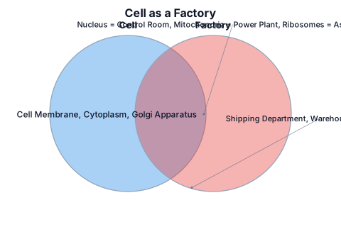
compare a cell to a factory(diagram) and illustrate any 3 cell organelles
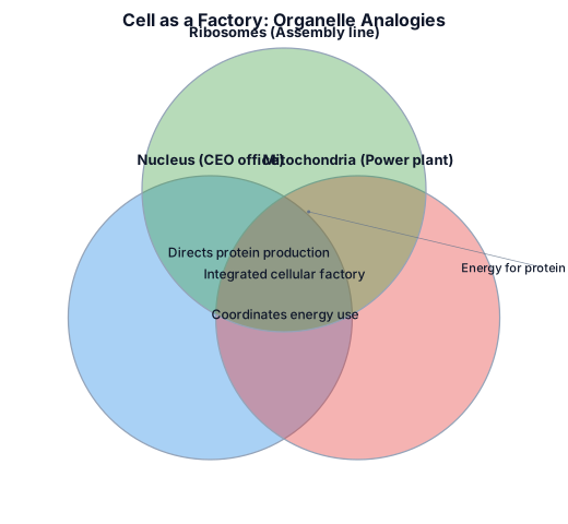
compare a cell to a factory and ilustrate any 3 cell organells
System Architecture The system architecture illustrates how the Career Path Prediction System processes user requests. When a student inputs data, the system processes the information through the application logic to generate results. The required data is retrieved and stored in the system, and the output such as recommended strand and course is then displayed to the user.
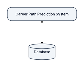
Edit the provided system diagram while preserving the **same layout, boxes, labels, shapes, font style, spacing, and overall visual appearance**. Make only the following change: * In the connection between the **CAREER PATH PREDICTION SYSTEM** and the **DATABASE**, add a second arrow pointing upward from the **DATABASE** back to the **CAREER PATH PREDICTION SYSTEM**. * The connection must therefore be **bidirectional**, showing: * Career Path Prediction System → Database * Database → Career Path Prediction System * Keep the existing downward arrow from the Career Path Prediction System to the Database. * Add the return arrow from the Database to the Career Path Prediction System without changing the position of either component. * The two-way connection should be clear, clean, and centered between the system box and database cylinder. Do **not** change any other arrows, labels, boxes, shapes, positions, or text in the diagram. The final diagram should look like the original except that the **Career Path Prediction System ↔ Database** relationship has arrows in both directions.
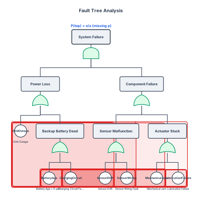
FAULT TREE
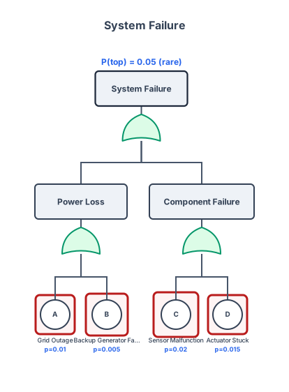
CREATE A FAULT TREE DIAGRAM
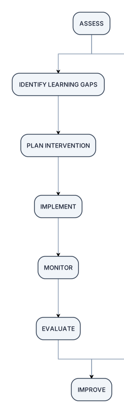
ASSESS ↓ IDENTIFY LEARNING GAPS ↓ PLAN INTERVENTION ↓ IMPLEMENT ↓ MONITOR ↓ EVALUATE ↓ IMPROVE Then connect IMPROVE → ASSESS to show that it is a continuous cycle.
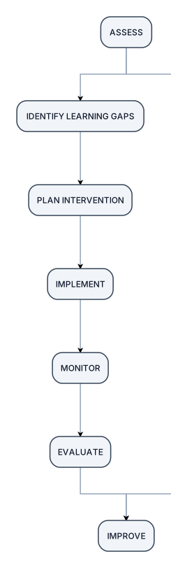
Slide 6 — Project Framework This should be a diagram, not a paragraph. PROJECT BRIDGE CYCLE ASSESS ↓ IDENTIFY LEARNING GAPS ↓ PLAN INTERVENTION ↓ IMPLEMENT ↓ MONITOR ↓ EVALUATE ↓ IMPROVE Then connect IMPROVE → ASSESS to show that it is a continuous cycle.
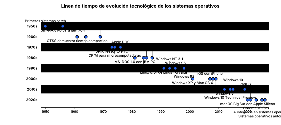
Diseñar una línea del tiempo colaborativa que represente conocimientos previos y nuevos adquiridos sobre evolución tecnológica de los sistemas operativos desde 1950-2026 que tenga como titulo "Linea de tiempo de evolución tecnológico de los sistemas operativos "con imagenes interactiva y con informacion clara y fechas en imagen
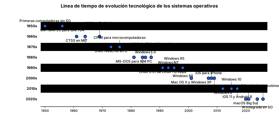
Diseñar una línea del tiempo colaborativa que represente conocimientos previos y nuevos adquiridos sobre evolución tecnológica de los sistemas operativos desde 1950-2026 que tenga como titulo "Linea de tiempo de evolución tecnológico de los sistemas operativos "con imagenes interactiva y con informacion clara y fechas
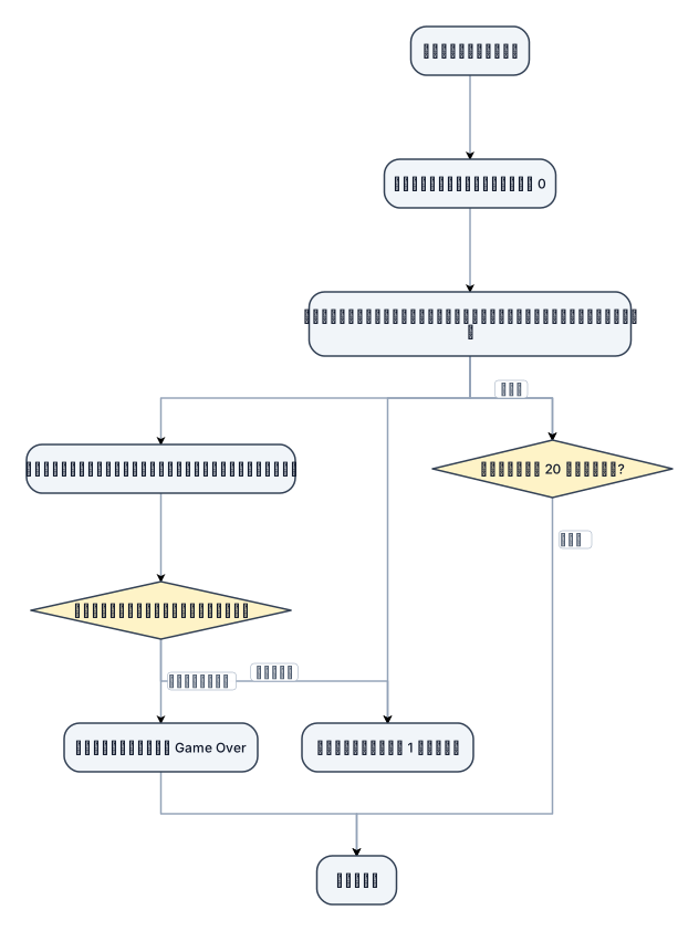
อัลกอริทึมเกม ^^ เริ่มต้นเกม ตั้งค่าคะแนนเป็น 0 สุ่มให้ผลไม้หรือผลไม้พิษตกลงมาจากด้านบน ให้เราบังคับตัวละครไปรับสิ่งที่ตกลงมา ตรวจสอบว่าเก็บสิ่งใด ถ้าเป็น ผลไม้ → เพิ่มคะแนน 1 คะแนน และสุ่มผลไม้ลูกใหม่ ถ้าเป็น ผลไม้พิษ → แสดงข้อความ “Game Over” และจบเกม ทำซ้ำขั้นตอนที่ 3–5 จนกว่าเวลาจะหมด (20 วินาที)
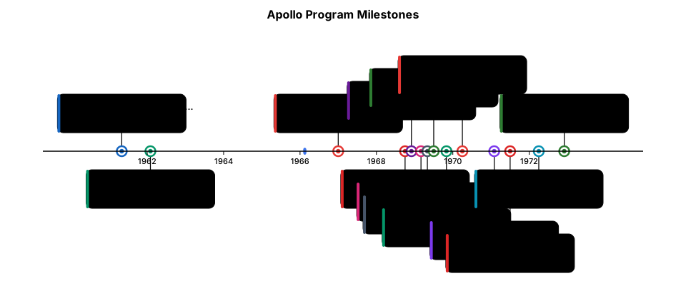
A timeline of the major milestones of the Apollo program from 1961 to 1972
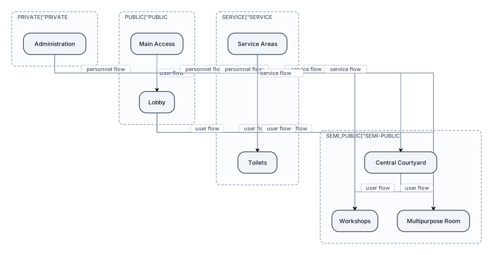
Generates an architectural operating diagram for a community center. Organize the spaces by public, semi-public, private and service areas. It represents by means of nodes and arrows the relationships and circulations between main access, lobby, administration, workshops, multipurpose room, toilets, central courtyard and service areas. Clearly differentiate the flows of users, personnel and service. The result must have a clean, architectural composition and suitable for a presentation sheet."
Focused examples and prompt ideas
Start with the complete visitor wall above, then use these focused collections when you want a narrower subject and more prompt context.
The first curated collection is being prepared.